Landing pages. Maybe you've designed one...or maybe you've designed hundreds. And whether you are a newbie or well-versed in mobile, you know that over the years user needs have changed dramatically. Gone are the days when mobile devices were the exception within digital marketing campaigns. Now they’re the norm — their usage impacts results and marketers need to satisfy those users.The spectrum of screen sizes and resolutions is broadening every day.
Did you know that 71% of media-using population is multi-screen? Seems pretty "normal" as I write this post in front of my laptop, 27-inch Thunderbolt display and (of course) my cell phone within arm's reach. Advertising and marketing success is dependent on delivering usable and satisfying experiences on all devices—smartphones, tablets and computers.
The need for responsive landing pages is becoming more and more obvious as we are bombarded with mobile growth stats:
"Smartphone sales reached 1 billion in 2012..."
"...expected to double by 2015!"
"Tablet ownership up 282% from Q1 2011 to Q1 2013!"
"Phablets now selling more than tablets, research says!"
Mashable declared 2013 "The Year of Responsive Web Design."
And then there's Google Enhanced Campaigns, which was mandated across all AdWords campaigns back in July. If you weren't ready for mobile, well, it didn't matter, because it happened.
So what does it all mean? Now is the time for all marketers and advertisers to accept that succeeding in digital means making your campaigns responsive. Not tomorrow. Today. RELATED CLASS: The Mobile Web & Responsive Design
The good news?
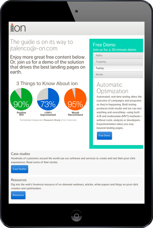
The promise of responsive design is that one page can satisfy everyone, on every device—large and small. Responsive templates can decrease the time it takes to build and publish your landing pages. There are platforms that allow marketers to create app-like responsive experiences that look and behave like they were custom-crafted by a team of expert designers and developers. (Shameless plug: ion's own platform has responsive templates.)
Below are 10 of my favorite best practices for responsive landing page design. Use these to ensure you are building landing pages that not only respond, but convert!
1. Design in your landscape smartphone viewport
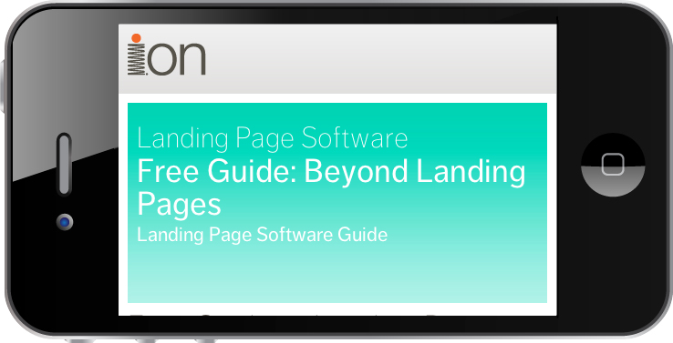
Start small & wide. Landscape smartphone viewport can have the widest possible image use cases. Start designing and previewing in this viewport.

2. Spin often
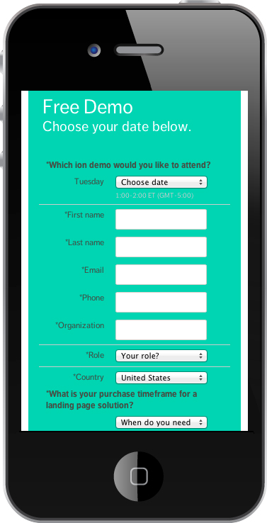
Continuously check your smartphone landscape viewport against your portrait viewport. Portrait is the most narrow and will require the most thoughtful & concise headline lengths.
3. Scroll frequently
Preview, preview, preview. Scrolling all the way down to the bottom of your pages will help you maintain the integrity of the entire page, across all viewports.
4. Create finger-friendly forms
Focus on how your forms scale, fit, scroll, their field types, how buttons behave & how hints and errors are surfaced.

5. Leverage interactive content
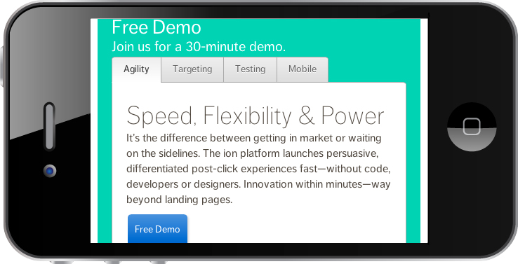
Mimic the mobile app. More content in less space with more elegance. Minimize long-page scrolling with tabbed content accordions and other app-like interactive elements.

6. Use highly communicative images
As your images change positions or size, notice how they are perceived at various viewports.
7. Make smart navigation choices
Decide how many navigation tabs responsive design can support. This depends, based on length of words.
8. Respond well to touch
Avoid on-states that create two-touch requirements for actuation.

9. Require everyone be responsive
Ensure video and other third-party media is responsive as well.
10. Design "mobile first"
Lastly, to expand upon designing in the mobile viewports, I recommend designing "mobile first." Mobile-first design is an approach that lends itself to a responsive world. It simply means that you create first and foremost for mobile — making the desktop your secondary focus. Mobile first forces the tough decisions — more concise content, more communicative imagery, and more thoughtful choices around conversion. When you make those tough choices for the small screen, the bigger screen benefits.
Right content, in the right place, for every user.
Done right, responsive pages put the right content in the right place on the page for every user. It significantly increases the probability that your campaign will convert visitors into leads, calls & sales. If that isn't reason enough to embrace responsive — staggering growth statistics and Google's Enhanced Campaigns certainly should be!
Learn how to adapt to mobile and tablet users with responsive design.
Watch The Mobile Web and Responsive Design, and get expert advice for developing your responsive design strategy. Learn the 6 reasons why mobile websites should lead your digital approach, the key steps and tools necessary for following Google's guidance on using responsive design, and when you should create special mobile sites, or use your core site for mobile traffic. Get instant access to this class now.